Influences. Who have been your influences? Who’s affected the way you live and the way you work?

WRITTEN & PHOTOGRAPHED BY: STEVE HOLLOWAY
INFLUENCES UPDATED OCTOBER 1, 2022. Influences are an important part of who we are. They serve as examples to help us define how we think and work. We practice what we learn over and over every day until conscious action becomes instinctive.
Here are my influences. Most are de facto mentors since I didn’t meet them except through their writings, seminars, articles and books. The one exception was Elyse Weissberg, my portfolio consultant.
It’s a long list. Long for a reason, I’ve never stopped learning. I first started studying their work to learn how design, images and the message work together. I had the great, good fortune to live through the time when they all were actively working, developing methods to persuasively deliver a message. I knew that, if I understood this relationship between images and message, I could create better photographs and be a better communicator.
To this day, they influence the way I think, the way I look at the world and the way I work.
I started the list with my first influence, Photographer W. Eugene Smith, followed by my newest, Cinematographer Grieg Fraser, added just last year, the cinematographer behind “Dune” and “The Batman”, then Photographer Dean Collins, the photographer I learned complex lighting theory from and finally, Photo Rep Elyse Weissberg, my portfolio consultant. After that, the list is in no particular order.

Photographer W. Eugene Smith.
This was the first photographer I studied, my first influence and my first understanding of how to tell a story with images.
I was able to view his photo essays in the original issues of Life Magazine when my cousin, Head Librarian at Texas Christian University in Fort Worth, Texas, got permissions for me to access the university library archives.
Photo essays including “Country Doctor”, “Spanish Village”, “A Man of Mercy” the Alfred Schweitzer essay and his last photo essay, “Minamata” depicting the victims of mercury poisoning in a Japanese fishing village.
Smith was meticulous in the darkroom, spending days getting what he had visualized out of each image. His technical mastery made his work the standard that photojournalism was measured by for years.
I have borrowed from the photo essay style more than once, telling a story through multiple images. I have also emulated his dedicated approach to getting the most out of each image.
Director of Photography, Cinematographer Grieg Fraser.
I’m going from my first to my newest influence, DP, cinematographer Grieg Fraser. I first saw his work in the video, “On Set with the iPhone 13 Pro” produced for Apple. Apple turned to Kathryn Bigelow, Oscar-winning director of “The Hurt Locker,” and Greig Fraser, Oscar-winning cinematographer of “Dune” and Oscar-nominated cinematographer of “The Batman”. His work on “The Batman” was characterized by Variety magazine as “reinventing the Dark Knight’s on-screen presence”.
Together they put the new iPhone through it’s paces to show how the 13 Pro has the potential to change film making.
I saw Apple’s promotional video long before I saw “Dune” and then “The Batman” in the theater. After “Dune” to some extent but especially after “The Batman”, I couldn’t stop talking about how impressed I was with the visuals. By the way he used light and camera position. It wasn’t until I was researching the Shot on iPhone Gallery post that I learned Fraser had filmed both movies. I started following his work, his Instagram posts at greigfraser_dp and his pod cast on Team Deakins.
Photographer Dean Collins.
For his mastery of photographic lighting and his ability to teach complex ideas by turning them into approachable, understandable material. No one at the time knew more about lighting than Dean Collins. And no one could teach lighting like he did.
I attended a Dean Collins 3 day seminar. He stood in front of a 12 screen, 48 projector slide show that illustrated every idea and principal behind lighting people, groups, interiors, products and, well, pretty much everything. Collins stood in front of the screens, talking fast and explaining one principal after the next and how to use it in day-to-day shooting.
I learned how to use light panels. How additive and subtractive lighting work. How to set the diffuse value and control subjective contrast, separation line, shadow brightness, edge transfer, specularity and background brightness. That, when you photograph a shiny object (like glasses), you want either the biggest light source you can find or the smallest light source you can find. And, how to make a single light source create a soft main light, a background light and a specular rim light.
This was the biggest single Aha! moment of my life. The moment I realized I could take on the most complex projects. That I could create any image no matter how technically demanding they were.
Photographer’s Representative and Portfolio Consultant Elyse Weissberg.
I met Elyse at a portfolio development presentation she gave during a ASMP chapter meeting. She is the one exception, the only influence I met in person.
Elyse was a New York City based photographer’s representative known for winning top accounts for her clients. She also consulted with freelance photographers throughout the country to develop their portfolios
When I returned to shooting full time, I worked with Elyse to develop a new portfolio targeted at larger agency, design firm and commercial accounts.
It was that work, the work she helped me develop, that secured several national accounts, Medicare Texas, LA, NY, Job Corps Texas and Oklahoma and The University of the Incarnate Word
Three years later, Amphoto published Successful Self-Promotion for Photographers, the book she coauthored.
The skills I developed working with Elyse are documented and taught in her book.
She directs photographers to know what you want and try to capture your vision in your photography.
That it’s not easy to establish yourself as a commercial photographer. But once you have gotten through the door, competed for and won jobs, and successfully completed work, the payoff is significant. Your ability to express yourself artistically and personally, and to experience the acknowledgment of your talents, within the industry, provides a satisfying sense of achievement. Plus, you will be making money, provided, that is, you learn how to target your market properly.
That to be successful as a commercial photographer, you must be not only good but excellent at executing your art and at running your business.
Chapter titles include Define Your Goals, Focus Your Image, Identify Your Market, Structure Your Portfolio, Marketing Basics and Make the Most of Portfolio Reviews.
We lost Elyse in 2001 but, fortunately for developing photographers her guidance lives on in Successful Self-Promotion for Photographers.

Photographer Bert Stern.
His images communicated big ideas using symbolism in easily understandable visuals. It was Stern’s book in the Masters of Contemporary Photography series that introduced me to photo illustration. Example? Stern photographed a martini in the Egyptian desert with a pyramid in the background symbolizing the “Driest of the Dry” for Smirnoff. Through the optics of the liquid and the martini glass, the pyramid appears upside down giving us the triangle of the pyramid, the triangle of the martini glass and the triangle of the optically inverted pyramid “in” the glass. Brilliant. (Search “Burt Stern Smirnoff desert” to see the original ad image).
Advertising Icon David Ogilvy
David Ogilvy of Ogilvy & Mather (still operating as Ogilvy). Partly for his approach to design but mostly for the way he wrote advertising copy and the rules he used governing advertising copy.
“Show, don’t tell” was his mantra.
Don’t just tell a reader how great you or your products are, instead, do your research. Know your reader’s interests. Show them the reasons why you’re great/it’s great and make the argument so convincing that they come to the conclusion you’re great all on their own.
Today, a universally accepted approach to selling is the Feature, Advantage, Benefit (FAB) model. Show a reader the feature(s) of a product or idea, show the advantage(s) that feature or features offer the reader, then show them the benefit they get from that feature by having/using the product or idea.
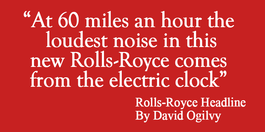
With that in mind, read the iconic headline Ogilvy wrote for Rolls-Royce, “At 60 miles an hour, the loudest thing you hear is the electric clock”. It seems to highlight one minor thing, the clock. But take another look. Ogilvy has told you the car can cruise at 60 MPH (this is a 1958 ad, a time when cruising at 60 MPH was significant), that the car isn’t “straining” to go 60 MPH (it’s so quiet you only hear the clock not the engine) and finally that the whole car is quiet (again, you only hear the clock).
The feature is how well the Rolls-Royce is engineered, the advantage is that it performs effortlessly and the benefit is it gives the user is a quiet, powerful, comfortable ride. And he did all of that by appearing to talk about the clock.
His approach to advertising, to marketing, to telling a story, is as relevant in today’s markets as it was over 60 years ago. Which is why he is still studied by advertising, marketing and editorial specialists. (His books are still available. Google “David Ogilvy Rolls Royce clock” to view the original Rolls Royce ad. Search “David Ogilvy on Zoombounce” for more of his copy rules. Worth the read.).
David Ogilvy lives on today. To see how follow his agency, Ogilvy, on Instagram.

Filmmaker Stanley Kubrick.
Kubrick for his approach to storytelling that refused to “dot every i and cross every t”. Kubrick relied on the viewer’s participation in the process by leaving it to them to finish parts of a story line.

13th Century French Architect Villard De Honnecourt.
Villard developed the famous diagram used to produce page layouts. It became the principal behind the grid approach to design, the act of dividing up space on the printed page to organize and align page elements and maintain a visual appearance across different media. It is the basis of print publication and electronic media design still in use today.
This concept of dividing up space went beyond the basic rule of thirds to communicate an idea. These concepts translated to both photographs and design projects.
Fashion Photographer Robert Farber.
Farber for his approach to composition, use of added, controlled diffusion and use of ambient light subtly supplemented with controlled sources. Farber’s painterly approach to photographing people translates to almost any story or subject idea.

Director, Screen Writer David Mamet.
Mamet for his classes on the art of film direction. While I work in still photography, his techniques are invaluable for answering the two questions every director (photographer) starts his day with: Where do I put the camera? What do I tell the actors (people in my photos)?
Since I specialized in photographing people on location, I used what I learned from Mamet every day. For example, there was a quote in an article that I recall, a student must go into a deadline-oriented professor’s office and tell him he won’t have his paper finished on time. Do you tell them what their motivation is? What they should be thinking? What their facial expression should be? NO. Tell them to walk over, turn the knob and go into the office. Except don’t tell them that the door is locked. Their sense of urgency will happen all on its’ own.

Andy Warhol.
Warhol for the way he used images in his work and in “Interview” magazine. Taking self-portraits, client Polaroid portraits and even other peoples’ images and turning them into poster-size, silk screen originals. And using objects and icons like soup cans, Brillo boxes and a banana as his subject matter.
Andy would have been so happy if he were with us today in our world of emojis, texting shorthand and the “famous for 15 minutes” social media life. It shows how perceptive he was, seeing communication the same way we communicate today. And seeing it over 50 years before it got here. (We miss you Andy!)
Photo Realist Portrait Painter Chuck Close.
Chuck Close’s work completely changed the way I look at portraiture. I always went for the smile, the open inviting, friendly smile. Chuck Close went for just the opposite.
I recall watching a video of one of his photography sessions (Close worked from large format Polaroids to make his paintings). He explained to his sitter not to worry about smiling, that actually he was “looking for no affect at all”, no emotion, no facial expression.
That phrase, “looking for no affect at all”, really stuck with me.
Close’s idea was that you learn more about a person when facial expression doesn’t color what you see. Take away the smile and you take away the tendency to discount an image. To think “nice smile” and move on.
Instead, you have to look deeper to form an opinion about what you see.
Starting in the 1960s, Close developed his paintings by starting with tiny abstracted shapes that, when viewed together, create mural-scale photo-realistic imagery. He proved the concept of pixels years before the first digital image was created.
For everything Close did for painting portraits, he did just as much for the photographic portrait.
His paintings started with a 20×24 Polaroid Portrait (selected from several Polaroids taken) of his subject that he worked from to scale up to a mural sized finished painting (8.9’ x 6.9’).
More than just a process tool, his Polaroid prints are so unique that they have become as sought after as his paintings are as an art form unto themselves.
An injury to a spinal blood vessel in 1988 nearly left Close completely paralyzed. After extensive rehab Close was able to work from a wheel chair with a paint brush attached to a holder on his arm. He couldn’t move around the canvas so he had a mechanical easel that moved the canvas for him.
His technique was intricate. He created one tiny shape at a time, over and over taking as long as 2 years to complete a painting. I recall an article where he said that he didn’t know any artist that took longer to create a work than he did!
Like Andy Warhol, Chuck Close will be missed and thought of often.

CHRIS 2016 / AN EARLY EXAMPLE OF CLOSE’S INFLUENCE ON MY PORTRAITS / © STEVE HOLLOWAY
These influences changed the way I look at the world, how I approach creating images and how I communicate ideas.
I’ve found that the smallest change in a design can make the biggest difference. That sometimes a design just doesn’t look right. Something is missing that should be there. Or something is there that shouldn’t be. Changing that creates a design that works together seamlessly with the story.
Chuck Close, bio and exhibits at Pace Gallery

- Shot on iPhone Toolbox [ Homepage ]
- Two Essential Skills [ Change How You Shoot ]
- Two iPhone Features People Take for Granted
- Toolbox How To Guides [ 27 Deep Dive Guides ]
- Translate your Skill Set into a Working Process
- IDEA FILE Shot on iPhone Gallery One
- IDEA FILE Road Portraits One
- IDEA FILE Road Portraits Two
- Digital Evolution
- From The Batman to Shooting on iPhone
- Making the Case For Shooting on iPhone
- Camera and Light Kit Ideas
- Copied on iPhone
- The Power of One Idea
- Becoming Proficient in Post Production
- Designing with Type
- Learning From Cinema
- How the Three Lenses on iPhone Work
- Here are My Influences [ Who are Yours? ]
- Steve Holloway [ Photographs ] Pre iPhone
- Steve Holloway [ Memoirs ]